The Progress Stepper in Aureus ERP is a status bar. It shows the stages of a record in a clear, visual way. Think of a sales order. First, it is new. Then, it becomes confirmed. Finally, it is done. Each stage looks like an arrow. So, users can read the whole flow at a glance.
Why it matters for your team
People love clarity. Moreover, a status bar removes guesswork from daily work. For example, a staff member opens an order. Right away, they know the current stage. As a result, teams move faster. Also, they make fewer mistakes.
Where you see it
You see this stepper on many records. In short, it fits any model with stages. Common examples include sales, purchases, and projects. In addition, support tickets use it too.

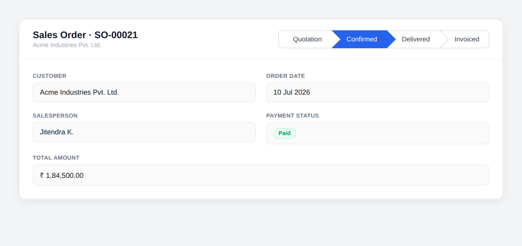
How the Progress Stepper works
The component is smart, yet simple. In fact, it builds on a standard Filament field. The form version extends the ToggleButtons field. Then, it swaps in a custom view for the arrow look.
|
1 2 3 4 5 6 7 8 |
namespace Webkul\Field\Filament\Forms\Components; use Filament\Forms\Components\ToggleButtons; class ProgressStepper extends ToggleButtons { protected string $view = 'fields::filament.forms.components.progress-stepper.index'; } |
The idea behind the design
The plan is clever, yet easy to follow. Basically, each stage is a radio button in disguise. The radio input stays hidden. Then, a styled label sits on top of it. So, users click a nice arrow. Behind the scenes, though, they pick a radio value.
Hiding the radio input
The radio must vanish from view. Therefore, the Blade view hides it with a few classes.
|
1 2 3 4 5 6 |
<input type="radio" value="{{ $value }}" {{ $applyStateBindingModifiers('wire:model') }}="{{ $statePath }}" class="peer pointer-events-none absolute opacity-0" /> |
The opacity-0 class makes it invisible. Also, peer lets the label react to its checked state.
The arrow trick explained
Now for the fun part. The arrow shape comes from one small square. The CSS adds a square with the :after rule. Then, it rotates that square by 45 degrees.
|
1 2 3 4 5 6 7 8 9 10 11 12 13 14 |
.stage-button:after { content: ""; position: absolute; top: 50%; right: -14px; width: 26px; height: 26px; z-index: 1; transform: translateY(-50%) rotate(45deg); background-color: #ffffff; border-right: 1px solid var(--gray-300); border-top: 1px solid var(--gray-300); transition-duration: 75ms; } |
Half of that square peeks out on the right. As a result, it looks like a sharp arrow point.


Clean edges on the ends
The bar needs tidy ends. So, the first and last steps get rounded corners.
|
1 2 3 4 5 6 |
.state-container .state:first-child .stage-button { border-radius: 8px 0 0 8px; } .state-container .state:last-child .stage-button { border-radius: 0 8px 8px 0; } |
The last step also drops its arrow. Because of this, the bar ends in a clean, flat edge.
Color that guides the eye
|
1 2 3 4 |
input:checked + .stage-button { color: #fff; background-color: var(--primary-600); } |
The other steps stay gray. As a result, the eye lands on the right stage fast.
Dark mode support
The stepper also respects dark mode. Therefore, it looks good on any theme. The CSS adds .dark rules for each part. So, borders and fills shift to darker tones. In short, users get the same clear arrows at night.
The display-only version
There is also a read-only version. In other words, it shows the stage but blocks any change. This version extends the Entry component. So, it fits well on view pages and reports. Here, every radio is disabled. Then, only the matching stage gets the checked mark
Enum support built in
Many records use PHP enums for status. Luckily, the stepper handles them with ease. It checks if the value is a BackedEnum. If so, it reads the plain value first.
|
1 2 3 |
if ($currentState instanceof \BackedEnum) { $currentState = $currentState->value; } |
After that, it compares as a string. As a result, enums map straight to stages.
Inline mode for tight spaces
Sometimes you need a compact look. For that, the stepper offers an inline mode.
|
1 2 |
ProgressStepper::make('state') ->inline(); |
Inline mode floats the bar to the right. So, it fits neatly inside a form row.
How to use it in your own form
Using it is easy. First, add the component to your form schema.
|
1 2 3 4 5 6 7 8 |
use Webkul\Field\Filament\Forms\Components\ProgressStepper; ProgressStepper::make('state') ->options([ 'draft' => 'Draft', 'confirmed' => 'Confirmed', 'done' => 'Done', ]); |
Then, bind it to a status column. So, each click updates the record stage. Finally, add an icon per stage if you like. After that, the arrows appear on their own.
A quick history
The form stepper is not new. In fact, it shipped with the very first release in early 2025. The display version came later. Specifically, the team added it in January 2026. So, the idea is proven. Yet, it keeps getting better over time.
Is it a default Filament feature?
No, it is fully custom. Filament does not ship a stepper like this out of the box. Instead, Aureus ERP built it on top of Filament. Therefore, it feels native but adds real value.
Final thoughts
The Progress Stepper in Aureus ERP is small but mighty. Above all, it makes record stages clear for everyone. It saves time. Moreover, it keeps your data clean and easy to read. So, if you build with Aureus ERP, try it. In the end, your users will thank you.