A Filament RepeatableEntry table is not available in the default component. Instead, Filament displays each record as a stacked card.
Therefore, in AureusERP, we needed these records to look like a real table with a header, rows, and totals at the bottom, so we built a custom solution.
In this post, we walk through the Filament Repeatable Entry table step by step using real code in plain language,
so you understand each part and why it matters.
Quick Summary
First of all, the default RepeatableEntry has no header row, no totals, and no column controls.
In contrast, our version extends it and introduces a ->table() layout.
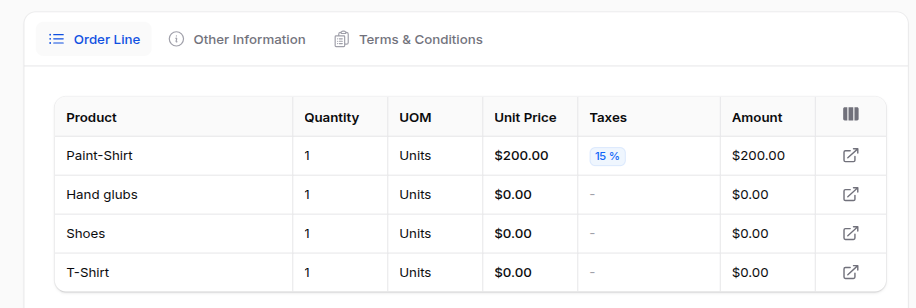
Users can show or hide columns, with preferences saved. Footer summaries like Sum, Average, Count, and Range are also included
However, if you do not opt in, it still behaves exactly like Filament’s default.
Limitations of the Default Filament Repeatable Entry Table
Before jumping into the solution, it is important to understand the limitations of the default component.
1. It only stacks cards
By default, Filament renders each item as its own grid.
As a result, there is no shared header row. For example, if 40 items have a “Quantity” field, the label appears 40 times instead of once at the top.
2. No totals
Furthermore, there is no footer or summary support. Therefore, calculating totals requires external logic and separate components.
3. No way to hide columns
Additionally, every field remains visible at all times. Consequently, different users cannot customize the view based on their needs.
4. Hard to scan
Because of these limitations, the layout becomes long and repetitive. As a result, reviewing data becomes slower and less efficient.
In short, the data is naturally tabular, but the default component does not present it that way.
The Approach: Extend, Don’t Replace
Here’s the important design decision. Filament’s schema handling, state resolution, and relationship loading are all solid.
Therefore we didn’t want to lose any of that — instead, we only wanted to change how the component draws items on screen.
So our component extends the base class rather than replacing it:
|
1 2 3 4 5 6 7 8 |
namespace Webkul\Support\Filament\Infolists\Components; use Filament\Infolists\Components\RepeatableEntry as BaseRepeatableEntry; class RepeatableEntry extends BaseRepeatableEntry { // table view, column manager, summaries… } |
What this gives you: if you never call the new methods, the component behaves exactly like Filament’s.
In other words, you opt into the table, and nothing breaks for existing code.
Turning On the Filament Repeatable Entry Table View
How you use it
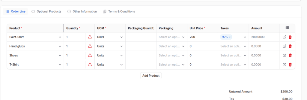
You switch to the table layout with->table(), listing your columns.
Your normal ->schema() still defines what renders inside each cell. The two are linked by name.
|
1 2 3 4 5 6 7 8 9 10 11 12 13 14 15 16 17 |
use Webkul\Support\Filament\Infolists\Components\RepeatableEntry; use Webkul\Support\Filament\Infolists\Components\Repeater\TableColumn; RepeatableEntry::make('invoiceLines') ->hiddenLabel() ->table([ TableColumn::make('name')->label('Product'), TableColumn::make('quantity')->alignCenter(), TableColumn::make('price_unit')->alignCenter()->label('Unit Price'), TableColumn::make('price_subtotal')->alignCenter()->label('Subtotal'), ]) ->schema([ TextEntry::make('name')->placeholder('-'), TextEntry::make('quantity')->placeholder('-'), TextEntry::make('price_unit')->money(fn ($record) => $record->currency?->name), TextEntry::make('price_subtotal')->money(fn ($record) => $record->currency?->name), ]); |
Storing what you configured
When you call ->table([...]), the component does two small things:
|
1 2 3 4 5 6 7 8 |
public function table(array|Closure|null $columns): static { $this->isRepeaterHasTableView = true; $this->tableColumns = $columns; return $this; } |
- It flips a flag (
isRepeaterHasTableView) to remember you want the table. - It stores the column definitions you passed in.
The one override that switches the layout
Then comes the override that changes everything:
|
1 2 3 4 5 6 7 8 9 |
public function toEmbeddedHtml(): string { if ($this->hasTableView()) { return $this->toEmbeddedTableHtml(); } return (string) parent::toEmbeddedHtml(); } |
This is the switch. So when Filament asks the component to render, we check: did you configure a table?
If yes, we render our table Blade view. If no, we hand off to the parent and behave like the default. In short, that single if is the whole opt-in.
How Columns and Schema Connect
Inside the Blade view, we loop over each item and only draw the components whose name matches a table column:
|
1 2 3 4 5 6 |
@foreach ($item->getComponents(withHidden: true) as $component) @continue(! $visibleColumns->has($component->getName())) <td><div>{!! $component->toHtml() !!}</div></td> @endforeach |
So TableColumn::make('quantity') defines the column (its header, alignment, width), and TextEntry::make('quantity') in the schema defines the cell.
Because both share the name quantity, the view glues them together.
That’s also why we keep TableColumn intentionally thin — it only carries display details like label, alignment, and width.
It never tries to be the field itself.
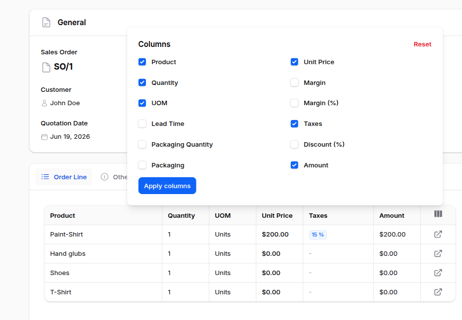
Letting Users Choose Their Columns
This was the most requested feature. Because different teams want different fields, we added a column for the manager.
How you use it
Mark the columns as toggleable and turn the manager on:
|
1 2 3 4 5 6 7 8 |
RepeatableEntry::make('invoiceLines') ->columnManager() ->table([ TableColumn::make('name')->toggleable(), TableColumn::make('discount')->toggleable(isToggledHiddenByDefault: true), TableColumn::make('taxes')->toggleable(), ]) ->schema([ /* … */ ]); |
A small dropdown appears in the table header. Tick a column on or off and the table updates.
A column like discount above starts hidden until someone goes looking for it.
Step 1: Build the list of toggle states
First, when the dropdown opens, getMappedColumns() reads any saved choices from the session and falls back to each column’s default:
|
1 |
$isToggled = data_get($savedState, "{$columnName}.isToggled", ! $column->isToggledHiddenByDefault()); |
So a column is “on” unless you hid it by default, or you previously turned it off.
Step 2: Decide what actually renders
Next, when drawing the table, getTableColumns() drops any column that you hid or switched off:
|
1 2 3 4 5 |
if (data_get($savedState, $columnName)) { return data_get($savedState, "{$columnName}.isToggled", false); } return ! $column->isToggledHiddenByDefault(); |
Step 3: Remember the choice
Finally, when you apply your selection, applyTableColumnManager() writes it to the session:
|
1 |
session([$this->getColumnManagerSessionKey() => $columnState]); |
The session key is unique per repeater:
|
1 |
return $this->columnManagerSessionKey ??= 'repeatable_entry_'.$this->getStatePath().'_column_manager'; |
Why this matters: because we build the key from the component’s state path, every repeater on every page keeps its own layout.
As a result, your invoice-line choices don’t bleed into your journal-entry choices.
The Livewire Glue Behind the Column Manager
The dropdown lives in Livewire, so we need a way for it to reach the right repeater and apply the change.
A small trait, HasRepeatableEntryColumnManager, goes on the page and finds the repeater by its state path:
|
1 2 3 4 5 6 7 8 |
public function applyRepeaterColumnManager(string $repeaterKey, array $columns): void { $repeater = $this->getRepeaterComponent($repeaterKey); if ($repeater) { $repeater->applyTableColumnManager($columns); } } |
Because it searches the schema recursively, you can nest the repeater deep inside tabs or sections, and the trait still finds it.
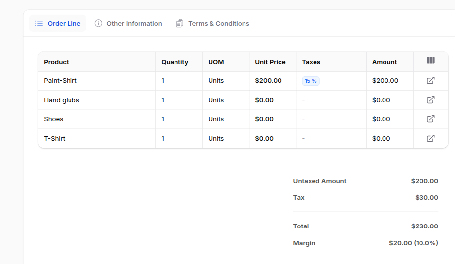
Adding Totals to the Footer
Tables of numbers want a footer. We ported four summarizers: Sum, Average, Count, and Range.
How you use it
|
1 2 3 4 |
use Webkul\Support\Filament\Summarizers\Sum; TableColumn::make('price_subtotal') ->summarize(Sum::make()->label('Total')); |
What the code does, step by step
Step 1 — Should there even be a footer? First, the view asks hasAnySummarizers().
If no column has one, the view skips the whole <tfoot> — so you never get an empty footer row.
Step 2 — Compute each column’s value. Next, getSummaryForColumn() finds the column, grabs its summarizer, and runs it over the current rows:
|
1 2 3 4 5 6 7 |
$value = $summarizer->summarize($items, $columnName); if ($summarizer->isNumeric() && is_numeric($value)) { $value = number_format($value, 2); } return $label ? "{$label}: {$value}" : (string) $value; |
It then formats numeric results to two decimals and adds the label in front, so you see Total: 1,250.00.
The summarizers themselves
Each one is tiny and does exactly what its name says:
- Sum — adds the column up:
$items->sum(fn ($item) => (float) $item[$columnName]) - Average —
$items->avg($columnName) - Count —
$items->count()(ignores the column, just counts rows) - Range — shows
min - max, with->minOnly()/->maxOnly()options
Need something custom? Every summarizer also accepts a closure through ->using(), so you can compute the value any way you like.
Resizable Columns
For dense tables — long product names next to tiny quantity cells — fixed widths never feel right.
How you use it
|
1 |
TableColumn::make('name')->resizable(minWidth: 200, maxWidth: 600); |
Drag the right edge of the header to resize. Double-click the handle to snap back to the default.
What the code does
The resizable() method just records your intent and the limits:
|
1 2 3 4 5 6 7 8 |
public function resizable(bool|Closure $condition = true, int|string|Closure|null $minWidth = null, int|string|Closure|null $maxWidth = null): static { $this->isResizable = $condition; $this->minWidth = $minWidth; $this->maxWidth = $maxWidth; return $this; } |
Meanwhile, a small piece of Alpine in the Blade view handles the actual dragging. As you drag, it clamps the new width between your minWidth and maxWidth.
Furthermore, it never lets a column shrink below 50px, so a column can’t accidentally disappear.
How the Filament Repeatable Entry Table Fits Together
Step back, and you’ll see we built the whole feature from one idea:
- One override (
toEmbeddedHtml) decides between the table and the default. - One Blade view draws the header, then the rows (matched to columns by name), and finally an optional footer.
- The session remembers each user’s column choices, per repeater.
Importantly, we never touched how Filament resolves state. So the table reads the exact same items the default layout would have — we only changed the drawing.
Where We Use It
It’s all over AureusERP now:
- Invoices and bills
- Journal entries
- Purchase agreements
- Manufacturing and work orders
- Product categories and packaging
In practice, any detail page with a list of related records — especially numbers worth totalling — tends to reach for it.
FAQ
Does this replace Filament’s RepeatableEntry? No. It extends it. Without the new methods, it behaves identically.
Are the column choices saved per user? Yes. The component saves them in the session, keyed per component, so each table keeps its own layout between visits.
Which summaries are available? Sum, Average, Count, and Range out of the box — plus a ->using() closure for anything custom.
Can the repeater be nested inside tabs? Yes. Because the column-manager glue searches the schema recursively, it still finds a deeply nested repeater.
Final words
Aureus ERP Product Packaging makes sure that the number of items in packages is the same for sales, buying, and inventory tasks.
Using set packaging makes shipping easier, cuts down on mistakes, and helps manage large amounts of products better.
Once the packaging is set up, teams can easily handle quotes, RFQs, deliveries, and receipts.

Be the first to comment.